
Table of contents
My Overview
My Overview is a Member-level personal dashboard on TeamScore. It shows how your days unfold by bringing together recent scores, activity summaries, and patterns across the past 30 days.
Its purpose is to help you understand your effort clearly so you can build sustainable habits and protect your focus.
Summary Cards
At the top of the page, three cards give you a quick snapshot of your recent performance:
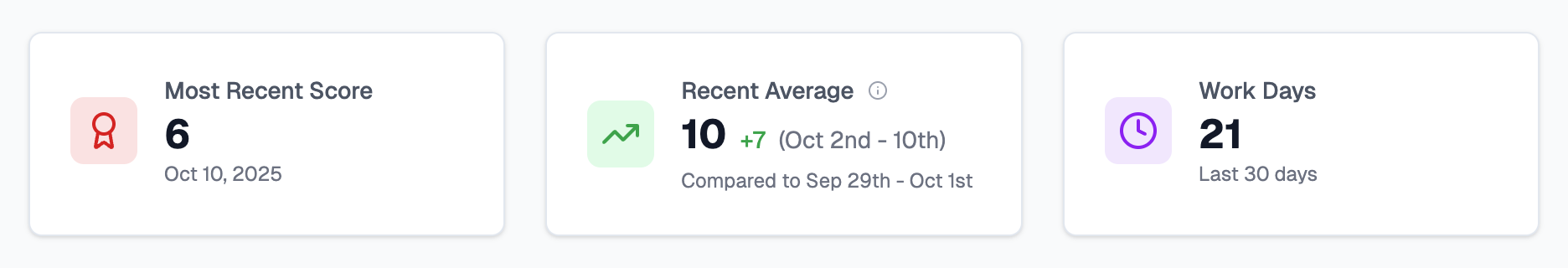
The Most Recent Score reflects how your last day went once all activity has been processed. Gives you an instant sense of how your last day went.
The Recent Average shows your rolling score across the latest 7-9 day period and how it compares to the previous one. Helps you notice improvement or dips over time.
The Work Days count displays how many of your last 30 days were recognized as workdays, excluding weekends and holidays. Keeps you mindful of your overall consistency and downtime.
Scores update automatically once your connected services finish sending their activity logs typically between 1:00 a.m. and 4:00 a.m. local time.
Recent Scores Chart
The Recent Scores chart visualizes your last 30 days. Each column represents a day. Height shows the total activity time detected. Color represents your performance relative to your target.
Performance range relative to your target:
🟥 Red (0 → 30) — low activity or disconnected day
🟨 Yellow (31 → 70) — below target but still present
🟩 Green (71 → 100) — target achieved: steady, healthy workday
🟦 Blue (101 → 130) — above target (slightly exceeded)
🟪 Purple (>131) — strong effort, but overwork/burnout potential.
Special indicators for exceptions:
🌴 Palm tree — recognized non-work day (weekend, holiday, or vacation)
⌛ Hourglass — score still being calculated (data syncing in progress)
Example insight: If you notice consistent green days followed by red ones, it might reflect travel days, meetings not logged in digital tools, or simply downtime. All normal patterns.
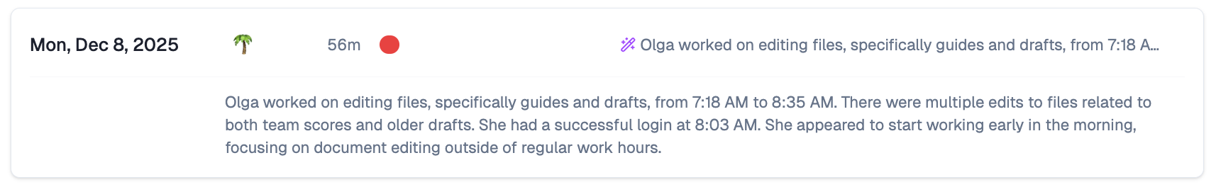
Daily AI Summaries
Below the chart, you will see a written summary for each day.
Each entry includes the date, your score badge, a duration bar, and a short explanation of the day's visible activity.
Example:
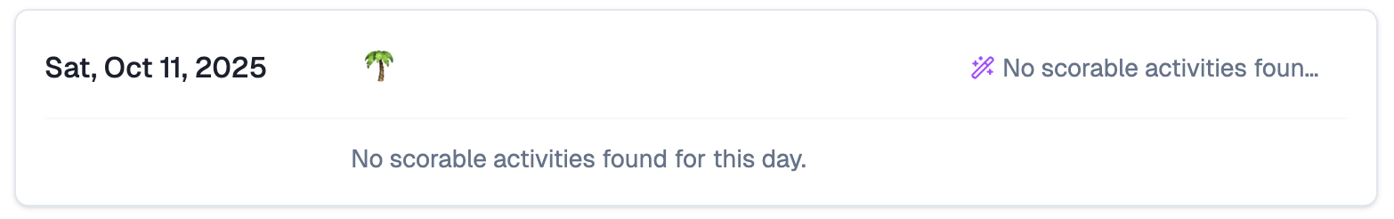
If no scorable activity was received from your connected services, the day will show the fallback message stating that no activities were available. This is normal for days off, offline work, or days spent in tools TeamScore does not yet integrate with.
Example:
Editing AI Summaries
You can edit the title and description of an your summaries if you meet one of the following conditions:
- You are the owner of the activity
- You manage the user who owns the activity
- You are an Executive on the account connected to the service
If none of these apply, the summaries appear in read-only mode.
Understanding Your Score
Your score reflects activity compared to your expected working hours. Most users have an 80 percent target to account for breaks, context switching, and untracked collaboration.
TeamScore collects signals from your connected services, converts them into a timeline, and compares your active time to your daily target. Calculations run overnight to ensure all data is included.
Lower scores do not automatically mean you did not work. In certain cases, they mean TeamScore did not receive complete information. As more integrations become available, a larger share of your workday will be represented.
When Activity Seems Missing
If several days appear lower than expected, a few checks usually resolve the issue.
Verify that your integrations are active under User Icon → Edit Profile → Services:
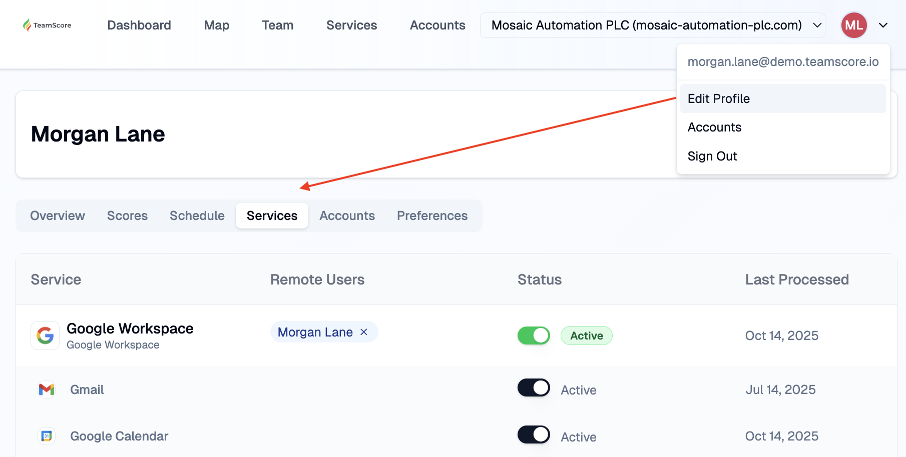
Ensure the tools you used that day are supported by TeamScore.
Confirm your time zone under Edit Profile → Overview:
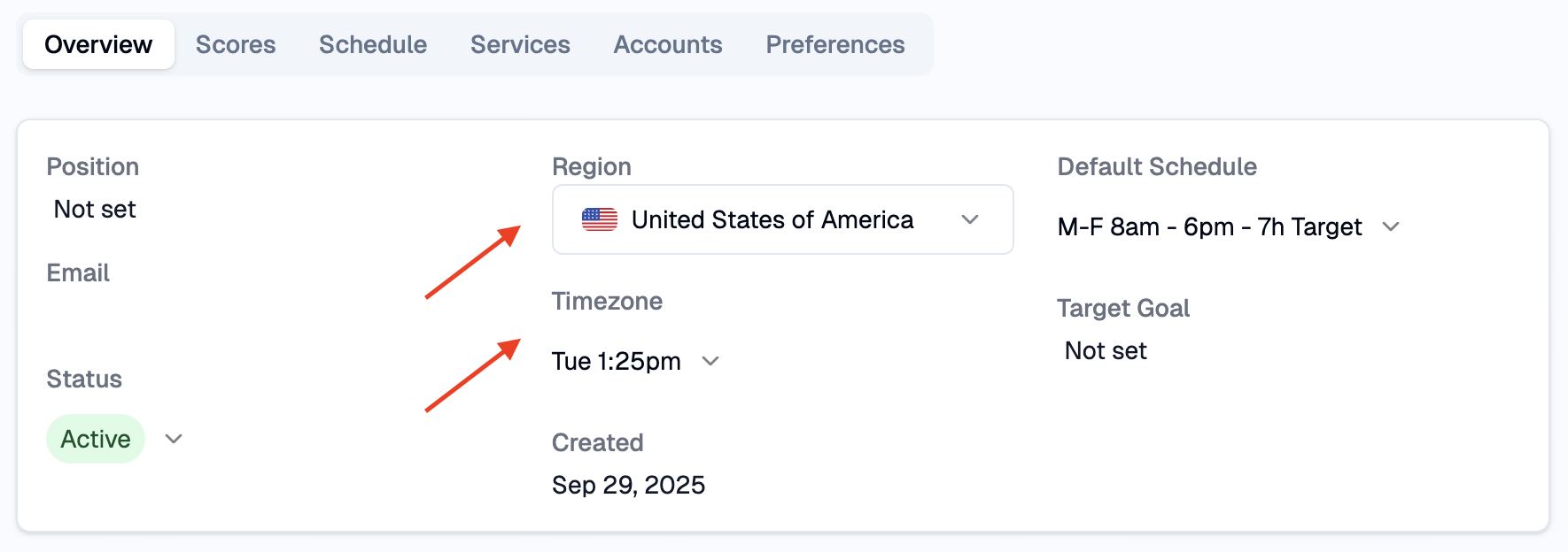
Incorrect time zones can offset hours and shift activity into the wrong day.
Using My Overview Effectively
Review your dashboard weekly to understand your natural patterns. Over time, you will notice which days feel smooth, which feel fragmented, and how your rhythm changes during busy periods.
Use the summaries to provide context for your chart. Quiet days may represent focused offline work or activity in tools not yet integrated with TeamScore.
A mix of green and yellow is healthy. Purple should be monitored, especially if appears frequently. Consistent overextension can be a sign that schedules or expectations need adjustment.
If something appears incorrect, review your connections. One inactive integration is often the reason for unexpected drops.
Privacy and Transparency
TeamScore never installs tracking agents or monitor devices. Everything shown in My Overview comes from your connected cloud services. Activity is displayed in your selected time zone so it reflects when work actually happened..
Next Steps
TeamScore Dashboard Overview — how the landing page adapts per role
Executive Overview — what managers see for their teams
Services List & Linking New Services — checking integration status