
Table of contents
Executive Overview
The Executive Overview is the leadership view in TeamScore. The dashboard brings together recent scores, activity patterns, and service connectivity so you can understand how work unfolds across your teams.
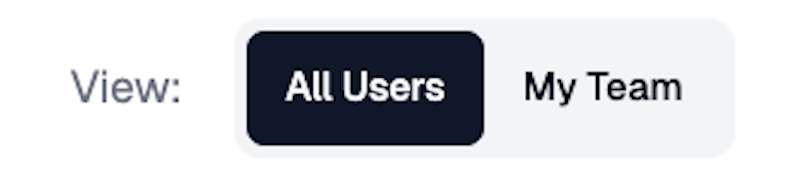
You can switch between:
- My Team — your direct reports
- All Users — everyone in your organization (available to owners and admins)
This screen summarizes recent performance. For single-day details, open the Activity Dashboard (Daily View).
Activity Feed
The Activity Feed shows a running list of users' recent actions from your connected services. Each entry includes the user's name, local time, location flag, activity type, and duration.
This helps you stay aware of work patterns without opening individual tools.
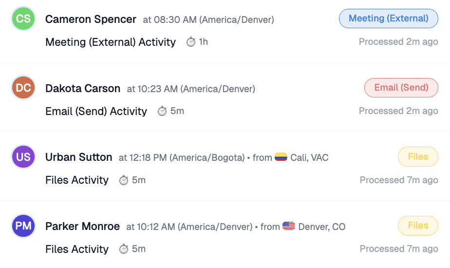
TeamScore displays only information already available in your connected services. It does not monitor devices or personal data.
Average Team Scores
This chart visualizes your team’s average Team Scores for each day over the last two weeks. Each bar height represents the team's combined performance intensity, with color indicating how the average relates to daily targets.
Performance relative to each user's daily target:
🟥 Red (0 → 30) — very light activity or disconnected services
🟨 Yellow (31 → 70) — below target but still present
🟩 Green (71 → 100) — target achieved: steady, healthy workday
🟦 Blue (101 → 130) — above target, strong collaboration or longer hours
🟪 Purple (>131) — sustained high effort or intense workload; burnout zone
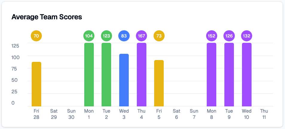
Scores update automatically once connected services finish sending activity logs, typically between 1:00 a.m. and 4:00 a.m. local time. The color system is the same one used in My Overview.
Activity Heatmap
Below the chart, the heatmap shows when your team is most active. Columns represent days; rows represent broad time-of-day ranges. Darker green cells indicate higher levels of activity.
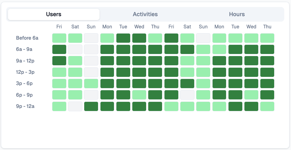
This view helps you identify collaboration windows, quiet periods, and patterns across time zones.
If you manage distributed teams, activity heatmap helps you balance schedules and reduce meeting fatigue.
Service Connectivity
At the bottom of the screen, service status indicators confirm whether your integrations are working as expected. You will see each connected service along with a brief status message.
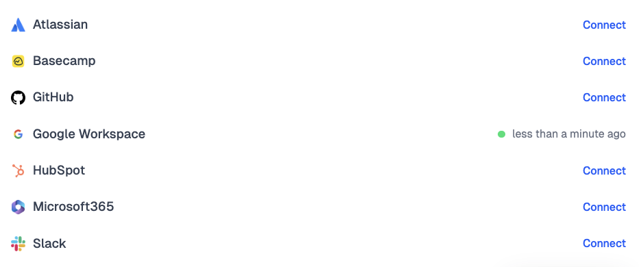
Consistently checking this section ensures that Team Scores reflect complete and accurate activity.
How TeamScore Interprets Activity
TeamScore measures activity relative to each user's schedule. A user's daily target is typically set slightly below their scheduled hours (default 80 percent) to account for non-digital work and breaks.
TeamScore gathers activity from connected cloud services, converts it into an activity timeline, and compares that timeline to the user's target. This calculation runs automatically once all logs are available.
Using the Executive Overview Effectively
Start with the overall trend in Average Team Scores. Review the heatmap to understand time-of-day patterns. If something stands out, visit the Activity Dashboard to get a detailed daily view.
Quiet periods should be interpreted in context. They can reflect deep-focus work, schedule differences, or gaps in activity. Follow up when needed.
Privacy and Access
TeamScore processes only metadata provided through secure API connections. Activity is translated into each user's local time zone, giving a fair and accurate representation across regions.
Only Owners, Admins, Executives, and Managers can access the Executive Overview.
Next Steps
TeamScore Dashboard (Home) — landing screen and role-based views
My Overview — personal insights, recent patterns, and score history
Services List & Linking New Services — checking integration status